
Tropics Jersey Concepts
The following are 11 initial concepts for the 2021-22 Tropics Hockey Club. It is only initial exploration so if there is a concept we like, we can begin to revise lettering, line width, logos, shoulder patches, shells etc. Each exploration contains orange, teal and white options for jerseys and socks.
_01
The first concept explores what the fictional Tropics Basketball Teams uniforms might look like as a hockey jersey. It’s not a one to one carryover but instead translates how hockey would use 70’s fashion and extravagance in an on ice uniform. Continuous flowing lines with stars and numbered socks portray the arrogance of Jackie Moon.

_02
The second exploration builds from the previous concept but adds in 70’s tropical shirt, old Florida vibe. It’s hidden under the arms, like the lining of a tuxedo so it is barely seen until we score. This style also adds a shoulder patch.
_03
An exploration into gradients and texture. The initial texture features an octagon but could be anything we like, simplicity is the key though as the texture runs in contrast to the gradient.

_04
A variation of the previous concept, this explores the idea of a monotone jersey style. While they seem relatively simple, the addition of black pants and gloves would look really nice.

_05
This explores the 70’s t-shirt style with horizontal stripes, the same way the 80’s Houston Astros uniforms did. This style is common in current retro surf wear - surf… tropics… hockey. (the white stripes might be a little too bold at this point but we could adjust). This style adds a number to the front chest.

_06
This concept explores the the same idea as in concept 04, what would a monotone version of this style look like? Again the simplicity combined with black pants and gloves would have a nice look.

_07
What would happen if we carried the horizontal strip theme but moved it the top and bottom of the jersey? It creates a retro feel while keeping the logo on a field of color. This style was popular in the 70’s and 80’s (hey, thats when the Flint Tropics took place!) and was utilized by teams like the Winnipeg Jets and Toronto Maple Leafs.

_08
Concept eight explores the motion of the water and palm trees in a tropical environment. No hard lines and everything flowing together as it moves from the jersey through the socks. Custom shells would complete this style nicely.

_09
After taking a break from designing jerseys and seeing what other options were out there, I wanted to come back to both the clean horizontal lines (very mid century modern) and combine them with a gradient. How can we create a gradient without using a traditional gradient? How can we get the logo to pop off the sweater when the colors are complimentary? This is the first look at using only the palm tree as the main logo.

_10
This concept explores the idea that most people have black pants and gloves. How can we keep the teal and orange as out main colours but integrate black? In initial explorations I stayed with the previous concept style but added a black accent.

_11
This concept explores using black as a third (4th?) color and integrating it into the design of a modern hockey jersey, no retro vibes here.

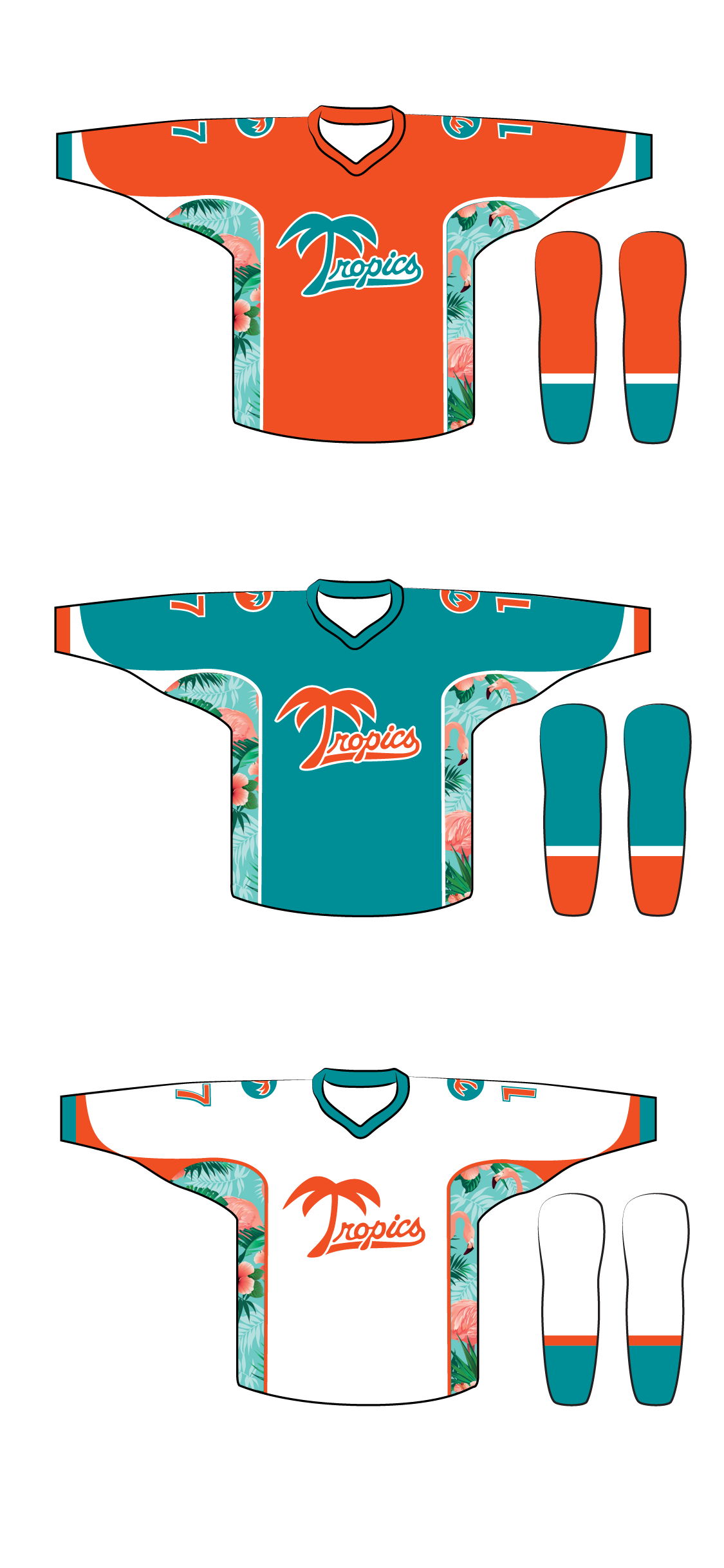
R_12
A combination of concept 01 and 02. Includes front and back and more flamingo. Shoulder patches are optional - not displayed.


R_13
A revision to concept 02 includes front and back and more flamingo


The Black Jerseys
Black revisions

